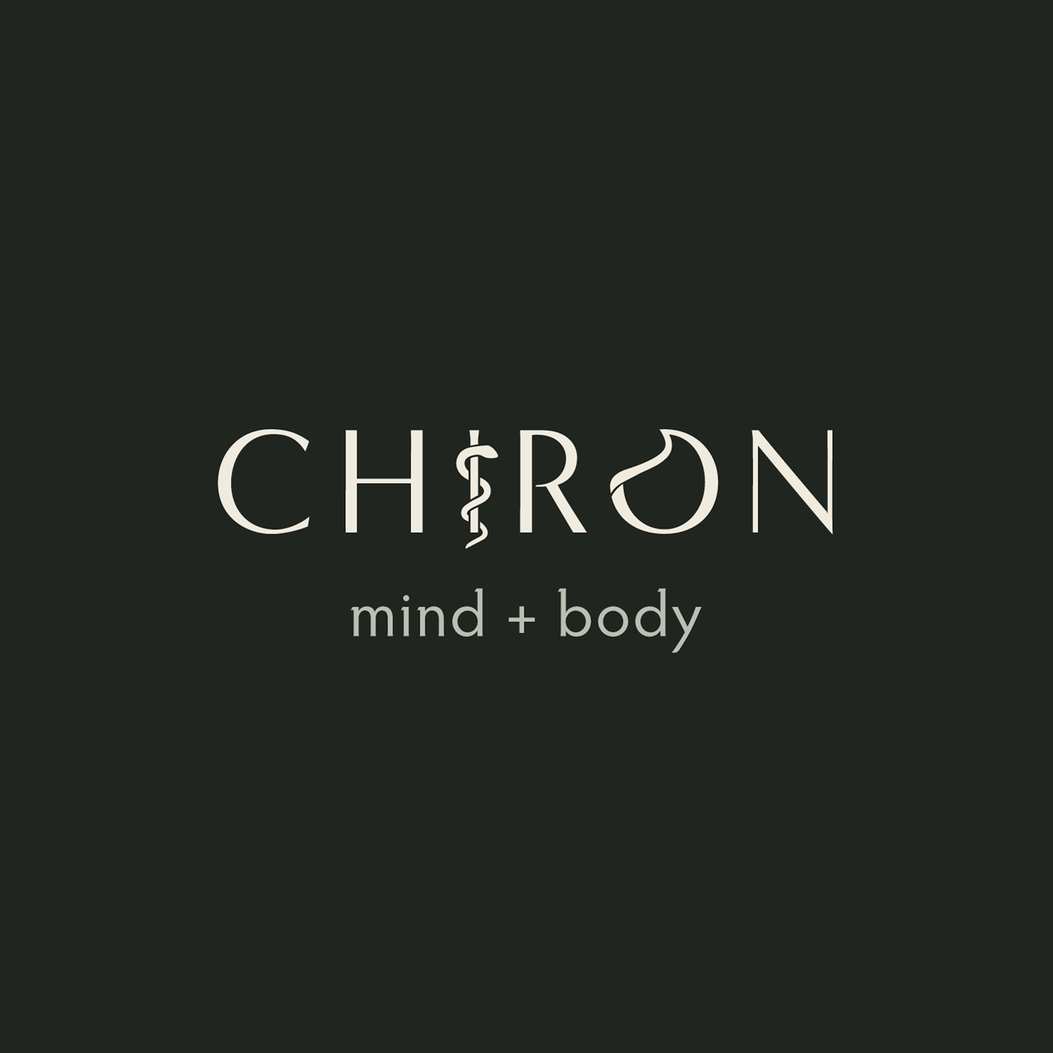
Chiron
Logo / Brand identity / Signage / Web design
Chiron, a Vancouver-based health coaching and kinesiology company, is dedicated to providing ‘no-nonsense’ guidance along your physical and mental recovery journey. The 'Chiron' tool is designed to educate, empower, and evolve with you.
When Chiron approached me for their logo and brand identity, they emphasized the key values they wanted to convey: Respect, Strength, Calm, and Creativity. They envisioned browns and greens for their colour palette and a minimalistic aesthetic throughout.
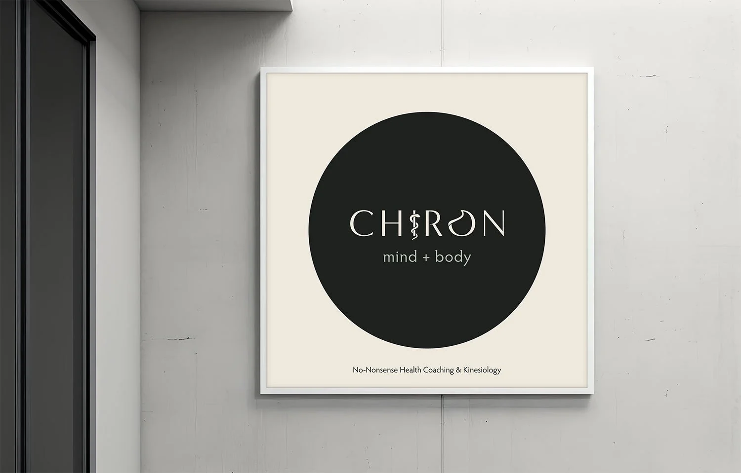
Studio poster
Signage
The chosen logo font exudes classic style and elegant simplicity, embodying the respect-worthy essence of the brand. The carefully selected muted, earthy tones of the brand colour palette reflect the serene and organic nature of Chiron's commitment to well-being.
Tablet
Mobile
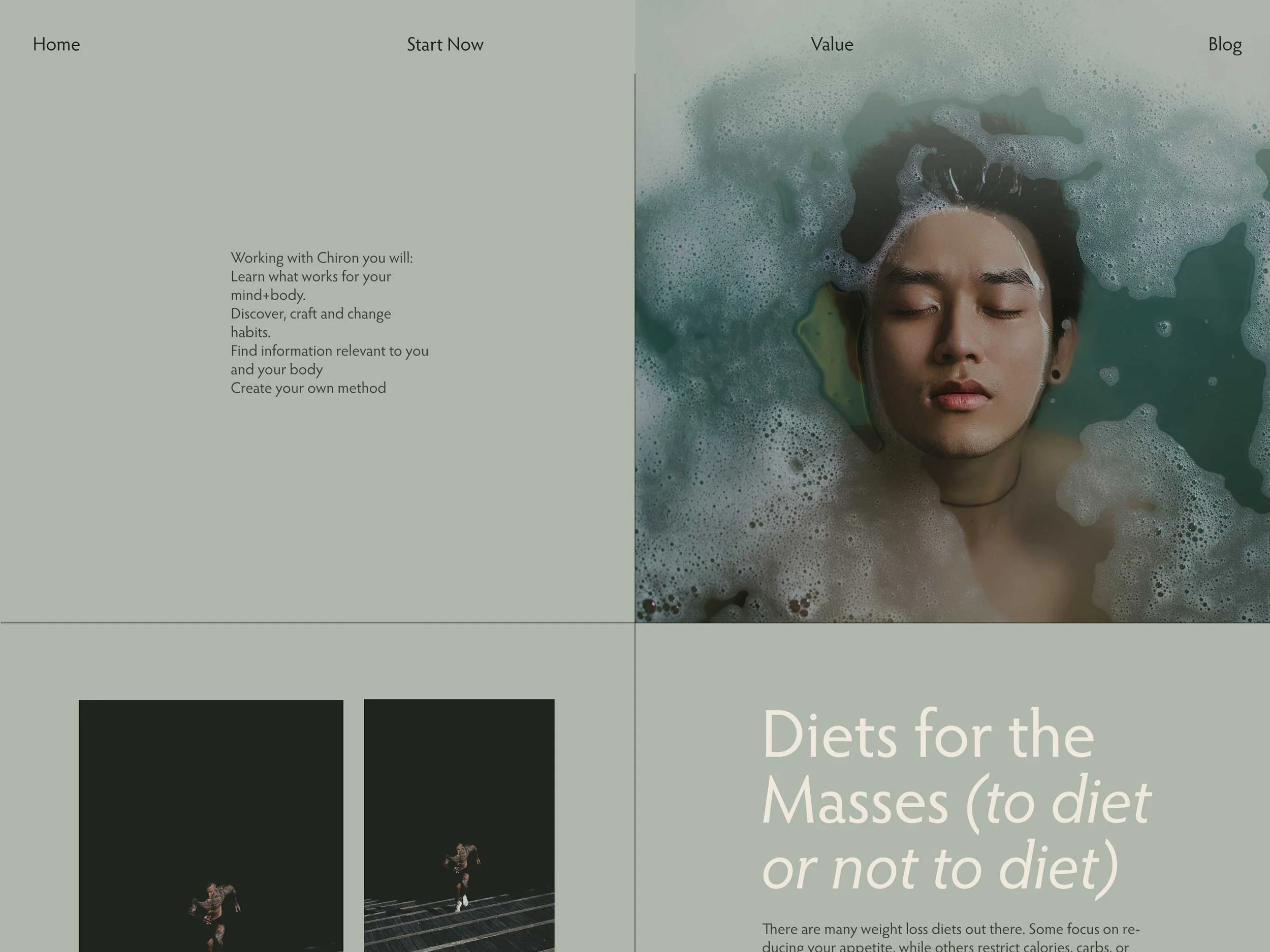
Desktop
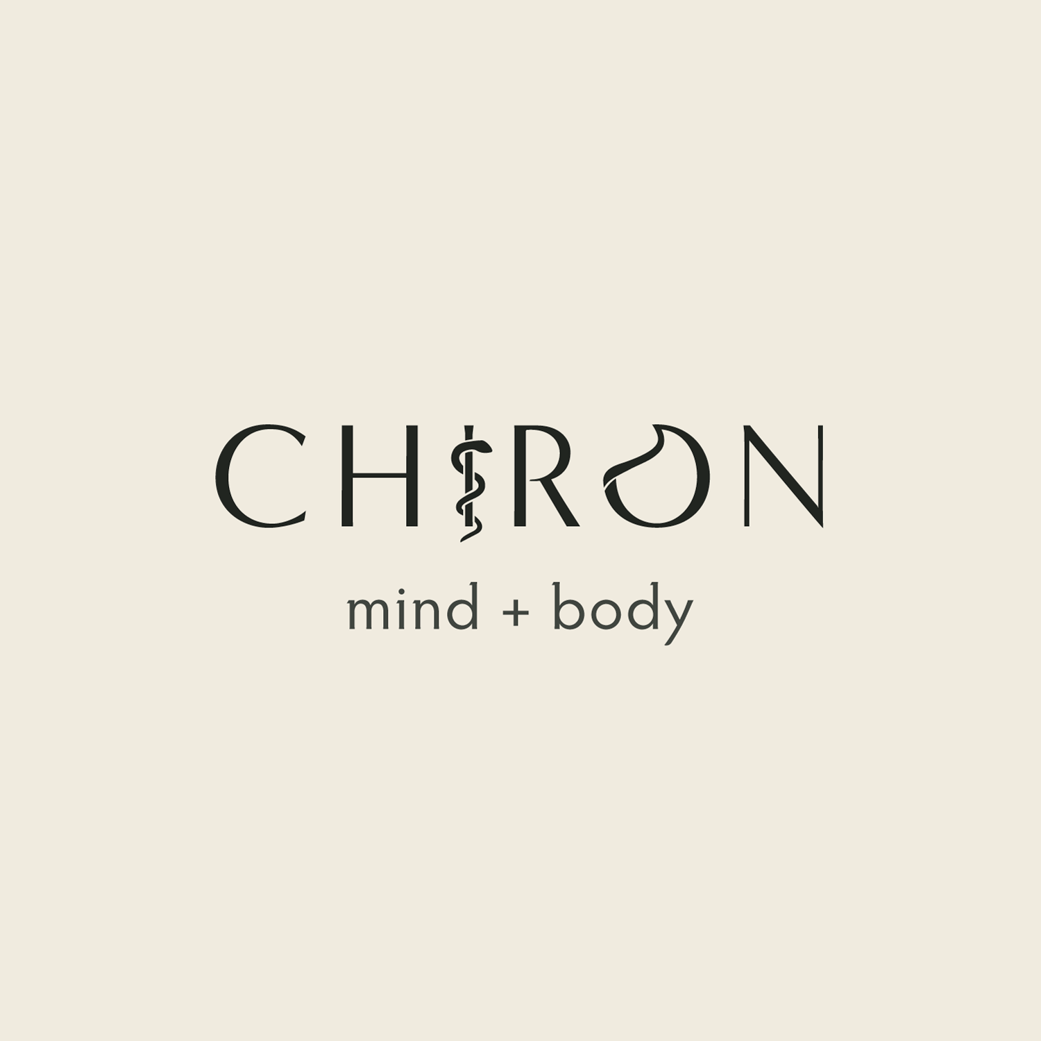
Inspired by the snake and staff symbol of medicine, Chiron liked the idea of using these elements to form the ‘i’ in the logo. We took it a step further by modifying the 'o' to also have a snake-like appearance, enhancing the logo's recognizability.
Logo Colour Variations

